css
!快捷创建
link快捷创建<link rel="stylesheet" href="css/style.css">
CSS Selectors
元素选择器
类型选择器
尽量使用class选择器
*通用选择器,选择全部元素本身
工作方式:瀑布式,自上往下,除非有更加具体的元素选择器,否则会被替代
引入了specificity的概念
具体的权重计算:https://specificity.keegan.st/
CSS Color
调色网站,还能检查对比度:https://coolors.co/
hsl调色,便于调出相辅颜色
CSS Unit&Size
rem:the root size 16px
vw问题
假设浏览器窗口宽度是 1920px,滚动条占了 17px:
| 概念 | 实际宽度计算 | 结果 |
|---|---|---|
100vw |
整个视口宽度 | 1920px |
| 可见内容宽度(不含滚动条) | 1920px - 17px | 1903px |
100% |
父元素内容宽度(1903px) | 1903px |
因此:
1 | body { |
会比实际内容宽(1903px)多出 17px,浏览器于是多出一个横向滚动条来显示这 17px。
CSS Box_Model
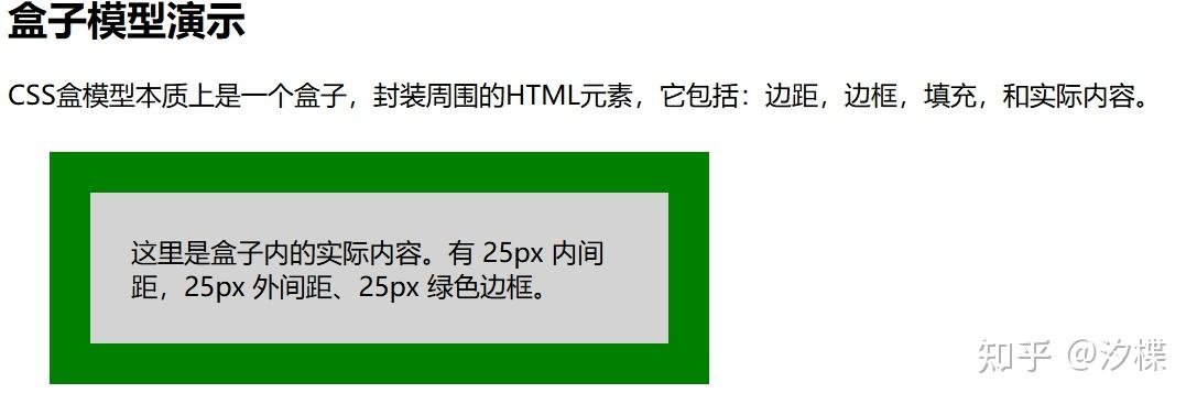
1.盒模型的组成部分
CSS盒模型每个 HTML 元素都被视为一个矩形盒子,由外到内包含:外边距(margin)、边框(border)、内边距(padding)、实际内容(content)四个属性。
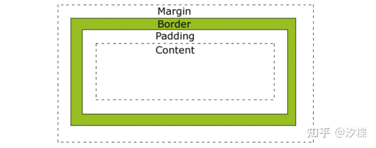
Margin(外边距):盒子与其他元素之间的透明间距;允许负值(margin: -10px)
Border(边框):分隔 padding 和 margin 的可见线条;可单独控制样式、宽度和颜色
Padding(内边距):内容与边框之间的透明区域;支持单边设置(padding-top/right/bottom/left)
Content(内容区):包含文本、图片等实际内容;通过 width和 height控制尺寸
2.两种盒模型模式
1. 标准盒模型(content-box)
- 默认模式
- 设定的width是content的宽度
- 元素总宽/高度(Margin内) = width+ padding+ border
1 | .box { |
2. 怪异盒模型(border-box)
- 设定的 width = 元素总宽度
1 | .box { |
3.盒模型的重要特性
1. 外边距合并(Margin Collapse)
- 垂直相邻的外边距会合并为较大值
- 当一个元素包含在另一个元素中时(假设没有内边距或边框把外边距分隔开),它们的上和/或下外边距也会发生合并。
- 仅发生在块级元素(不包括浮动/绝对定位元素)
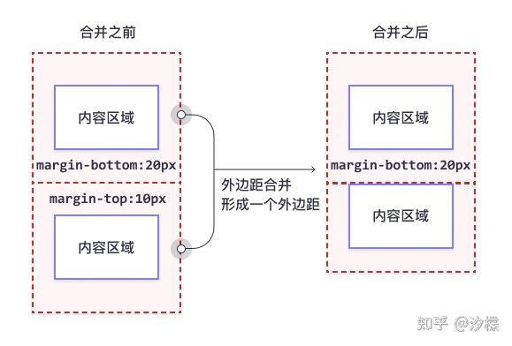
1 | <div class="a" style="margin-bottom: 20px;"></div> |
解决方案:
- 使用 padding替代
- 创建 BFC(如添加 overflow: hidden)
2.块级盒子 (block box)
- div就是一个块元素,块元素就是会独占一行,高度被内容撑开
- 内边距(padding), 外边距(margin), 边框(border) 会将其他元素从当前盒子周围“推开”
- 除非特殊指定,诸如标题h1和段落p等默认情况下都是块级的盒子。
3.内联元素的盒模型(inline box)
- 高度和宽度都由内容撑开;只占自身大小;
- width/height对行内元素(如 )无效
- 垂直方向的 padding/margin不影响布局(但水平方向有效)
- 用做链接的a 元素、em 以及 strong 都是默认处于 inline 状态的
4.调试技巧
1. 浏览器开发者工具
Chrome 的 Elements → Styles 面板直观显示盒模型:Firefox 的 DevTools 中查看一个元素
2. 轮廓调试法
1 | * { outline: 1px solid red; } /* 不影响布局的临时边框 */ |
实战案例
1 | <!DOCTYPE html> |
CSS文字相关
text-decoration
text-transform
text-align
line-height
font-family 三个字体,后两者备用
外部字体的引入:https://fonts.google.com
styling links
伪类表示元素的当前状态
1 | a { |
list styles
list-style-type
list-style-image: url('../images/checkmark.png');会将其覆盖。
nth-child伪类,指定某一项
1 | /* 一个值:四边相同 */ |
float
float 是 CSS 里的一种布局方式,它的意思是:
“让这个元素浮起来,并靠左或靠右排列,文字等内容会绕着它流动。”
就像 Word 里插入一张图片,然后设置“文字环绕”一样。👇
🖼️ 想象:
一段文字中放了一张小图片,你设置图片浮动到右边,那么文字就会自动在图片左边环绕排布。
1 | float: left; /* 向左浮动 */ |
position
| 值 | 中文解释 | 是否脱离文档流 | 参考定位对象 | 是否受 top/right/bottom/left影响 |
|---|---|---|---|---|
static |
默认值(普通流) | ❌ 否 | 无(正常文档流) | ❌ 否 |
relative |
相对定位 | ❌ 否 | 自身原来的位置 | ✅ 是 |
absolute |
绝对定位 | ✅ 是 | 最近的“已定位祖先” | ✅ 是 |
fixed |
固定定位 | ✅ 是 | 浏览器视口(屏幕) | ✅ 是 |
sticky |
粘性定位 | ❌/✅ 混合 | 滚动容器 | ✅ 是 |
绝对定位元素会相对最近的已定位祖先(position ≠ static)进行定位。
flexbox
https://www.joshwcomeau.com/css/interactive-guide-to-flexbox/
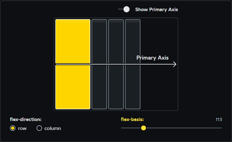
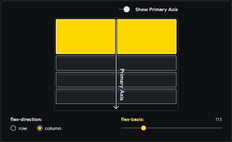
With flex-direction: row, the primary axis runs horizontally, from left to right. When we flip to flex-direction: column, the primary axis runs vertically, from top to bottom.
In Flexbox, everything is based on the primary axis. The algorithm doesn’t care about vertical/horizontal, or even rows/columns. All of the rules are structured around this primary axis, and the cross axis that runs perpendicularly.
The children will be positioned by default according to the following 2 rules:
- Primary axis: Children will be bunched up at the start of the container.
- Cross axis: Children will stretch out to fill the entire container.
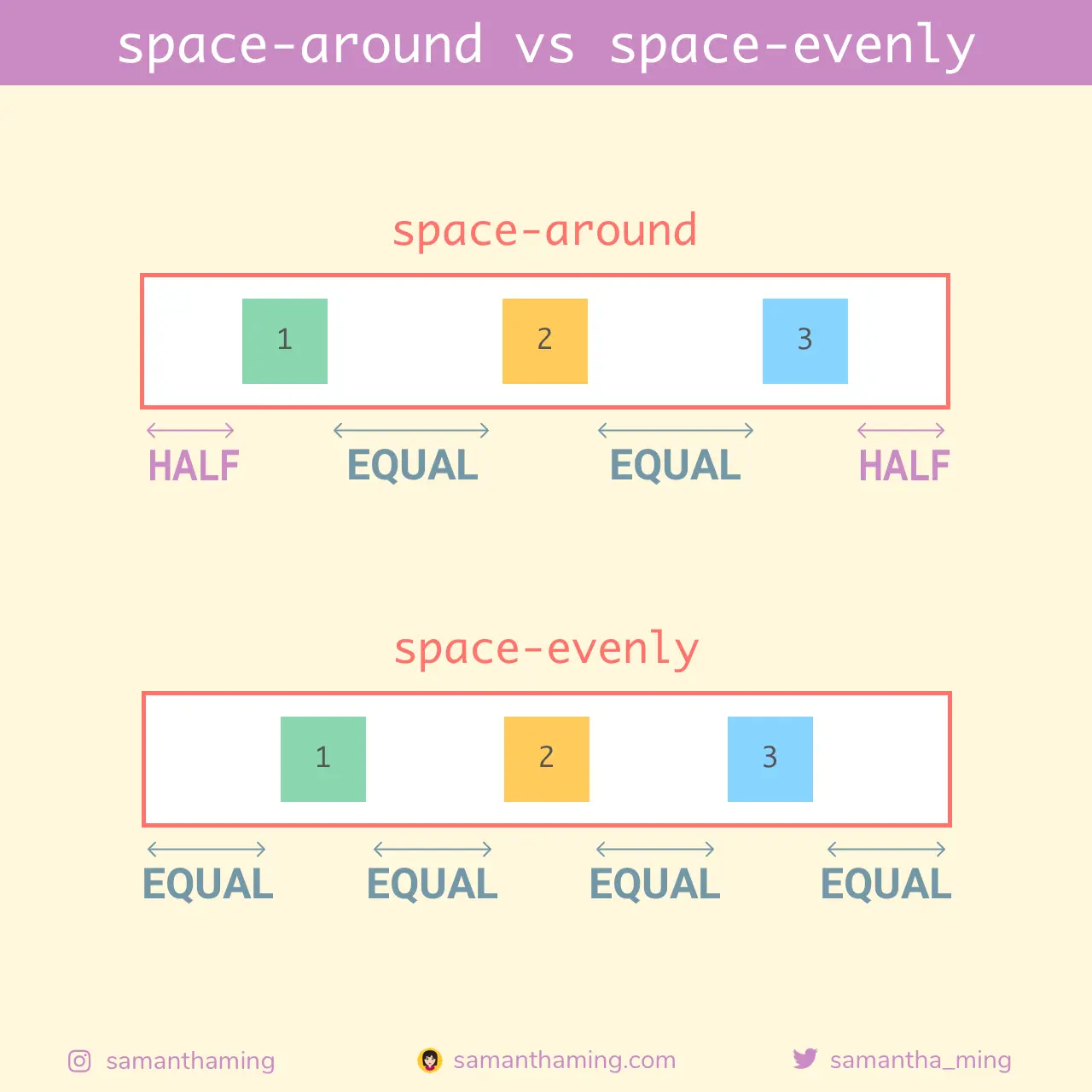
We can change how children are distributed along the primary axis using the justify-content property.
This is the fundamental difference between the primary/cross axis. When we’re talking about alignment in the cross axis, each item can do whatever it wants. In the primary axis, though, we can only think about how to distribute the group.
- justify — to position something along the primary axis.
- align — to position something along the cross axis.
- content — a group of “stuff” that can be distributed.
- items — single items that can be positioned individually.
Hypothetical size
1 | <style> |
In Flow layout, width is a hard constraint. When we set width: 2000px, we’ll get a 2000-pixel wide element, even if it has to burst through the side of the viewport.
In Flexbox, however, the width property is implemented differently. It’s more of a suggestion than a hard constraint.
This is a core part of the Flexbox philosophy. Things are fluid and flexible and can adjust to the constraints of the world.
Growing and shrinking
flex-basis
The Flexbox authors created a generic “size” property called flex-basis. It’s like width or height, but pegged to the primary axis, like everything else. It allows us to set the hypothetical size of an element in the primary-axis direction, regardless of whether that’s horizontal or vertical.
同样作为一种suggestion,过大会自适应而不会溢出
flex-grow
The default value for flex-grow is 0, which means that growing is opt-in. If we want a child to gobble up any extra space in the container, we need to explicitly tell it so.
What if multiple children set flex-grow? In this case, the extra space is divided proportionally between children based on their flex-grow value.
flex-shrink
两个子元素如果是500px,容器为400px,那么则需要放弃100px。flex-shrink属性让我们决定如何支付这种平衡。
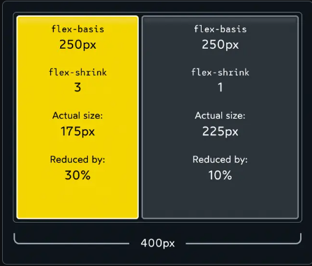
那么也就衍生出了防止收缩的方法,只要设为0,便不参与损失部分的比例分配。
设置min-width也可以。
Gaps
Gap allows us to create space in-between each Flex child.
margin
Auto margins will gobble up the extra space, and apply it to the element’s margin. It gives us precise control over where to distribute the extra space.
margin-left,margin,margin-right
Wrapping
flex-wrap:wrap
Each row is its own mini Flexbox environment. align-items will move each item up or down within the invisible box that wraps around each row.
Grid
https://cssgridgarden.com/#zh-cn
1 | .wrapper { |
1 | .parent { |
fraction比例分配,跟flex-grow的性质相似。fr单元分配额外空间。首先,列宽将根据其内容进行计算。如果有任何剩余空间,它将根据fr值进行分配。grid-template-columns和grid-template-rows分别定义列和行的布局。显式行。grid-template-columns: repeat(7, 1fr);repeat 函数将为我们执行复制/粘贴操作。
默认情况下,grid会将每个子元素分配到第一个未被占用的网格单元,
grid-row 和 grid-column 属性允许我们指定网格子项应占用哪个轨道。
grid-column: 1 / -1将跨越网格宽度。
1 | .child { |
1 | .parent { |
对齐方式
一个字符串 = 一行
字符串里用空格分隔列,用引号换行分隔行
重复的名字 = 合并单元格(区域必须矩形)
句点 . 或 连续多个 . = 留空白格
justify — 处理列。
align — 处理行。
content — 处理网格结构。
items — 处理网格结构内的 DOM 节点。
place-content: center;的本质就是:
1 | .parent { |